I first picked up a protest sign in my early twenties, back when I thought outrage alone was enough. I stood in a crowd, shouting slogans that felt important but looked interchangeable. The signs around me were hand-lettered on cardboard, sincere but forgettable. It was only when someone held up a sign that read "Free Mustache Rides" that the crowd actually laughed, and then listened. That moment taught me something about political communication that has only grown more true: humor cuts deeper than anger, and satire sticks longer than a lecture. Today, the most effective visual statements in activism aren't earnest declarations. They are satirical protest designs that twist corporate logos, mimic government posters, and turn the machinery of consumer culture against itself.
The Long Tradition of Laughter as Rebellion
Satire in protest is not new. The political cartoon has been mocking the powerful for centuries, and the peace symbol itself emerged from a British designer's anti-nuclear campaign that borrowed from semaphore and the cross. But the deliberate, strategic use of parody in protest graphics really sharpened in the late twentieth century. The Situationist International gave us détournement, a technique of taking existing media images and recontextualizing them to expose hidden meanings. This was not just vandalism. It was a critical method. When you take a glossy cigarette ad and change the tagline to something about lung disease, you are practicing détournement. When you paste a fake sign over a bus stop advertisement that says "This space for rent by the makers of the obesity epidemic," you are doing culture jamming.
These techniques became the DNA of modern satirical protest designs. They allow activists to speak the visual language of the very systems they oppose, then flip it. The effect is disorienting for the viewer, and often more memorable than a straightforward message. I have seen people stop mid-stride to stare at a cleverly subverted ad, where they would have walked right past a standard protest banner. That pause is the opening. That is where reflection begins.
Pioneers of the Form
Anyone who has walked through a city in the last twenty years has seen the work of Shepard Fairey, even if they do not know his name. His Obey Giant campaign started as a street art inside joke, a sticker of wrestler André the Giant that spread from skate parks to urban walls until it became an icon of ironic branding. Fairey later turned that same visual language into the Barack Obama "Hope" poster, but his earlier work was pure culture jamming. The Obey Giant was an experiment in how easily a symbol can become a brand without any product behind it. It was a critique of control, wrapped in the very aesthetics of control.
Around the same time, the British artist Banksy was making stencils on the Israeli separation wall and painting rats holding signs. His work is the most famous example of street art as protest, but it is also a master class in satirical protest designs. A Banksy image of a girl letting go of a balloon, or a rioter throwing flowers instead of a Molotov cocktail, uses the same visual shorthand as commercial advertising, but it sells a different idea. It sells doubt, empathy, and resistance. His work has been auctioned for millions, which creates its own kind of irony, but the original act of putting those images on public walls without permission remains a powerful act of billboard liberation.
Subvertising and the Art of the Prank
There is a specific term for the practice of hijacking advertising space to deliver a political message: subvertising. It combines "subvert" and "advertising." Groups like Adbusters have been doing this for decades, creating spoof ads that mock consumerism, militarism, and environmental destruction. Their work is not just clever. It is tactical. They understand that the average person sees thousands of commercial messages a day, and that a single subverted billboard can break through that noise more effectively than a hundred leaflets.
The Yes Men took this approach even further by impersonating corporate spokespeople at real events. They would give presentations as a representative of the World Trade Organization, announcing absurd policies that sounded just plausible enough to be believed until the punchline landed. Their pranks were performance art, but they also relied on satirical protest designs. Fake logos, fake product packaging, fake official documents. Every detail was designed to look authentic until the moment of revelation. That moment of cognitive dissonance, the split second when the audience realizes they have been fooled, is exactly what culture jamming aims to create.
I have seen this work on a smaller scale too. A friend of mine once printed stickers that looked exactly like the logo of a major oil company, but with the tagline changed to "We drill your grandchildren's future." He stuck them on gas pumps. People took photos. The company had to hire someone to scrape them off. For a few weeks, every driver who filled up saw that message. That is the power of subvertising. It turns the infrastructure of advertising into a weapon against itself.
The Visual Grammar of Resistance
Satirical protest designs rely on a shared visual vocabulary. You need to know the original symbol to understand the parody. That is why the most effective designs often target the most ubiquitous brands and icons. The peace symbol, for example, has been parodied into an anti-war missile, a dove with a gun, a cracked and broken circle. Each variation assumes the viewer knows the original. The same is true for the Ronin, the masterless samurai figure that appears in some protest art as a symbol of individual defiance against corrupt systems. The Guerilla Girls, the anonymous feminist artist collective, use the gorilla mask as a visual pun, hiding their identities while calling out sexism in the art world. Their posters are simple, direct, and devastatingly funny. One shows a female nude with a gorilla head and the text "Do women have to be naked to get into the Met. Museum?" It is a sign pun turned into a statistical indictment.
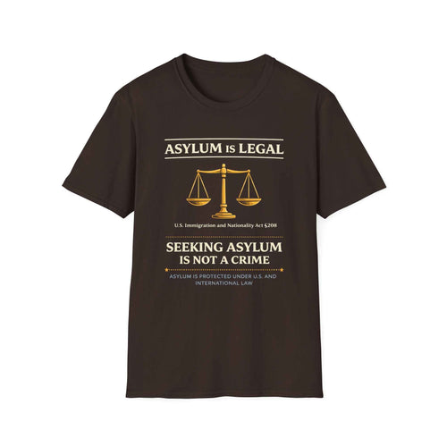
Typography itself has become a tool of protest. The anarcho-typo style, with its rough, hand-drawn letters and jagged edges, rejects the clean corporate fonts of mainstream media. It signals urgency, DIY ethics, and a refusal to be polished. You see it on zines, on stickers, on the posters wheat-pasted to construction hoardings. It is the opposite of the smooth, aspirational typefaces used in advertising. It is a visual declaration that this message was not made by a committee.
Where Satire Meets the Streets
I have stood in crowds at marches where someone brought a t-shirt cannon loaded with socks that had political slogans printed on them. The crowd cheered, not because the socks were needed, but because the act of turning a symbol of sporting spectacle into a distribution method for protest messages was so perfectly absurd. That is the spirit of culture jamming. It takes something familiar, the t-shirt cannon, and repurposes it for a new kind of delivery. The shirt itself becomes a walking billboard for the cause, but the humor of how it was delivered makes people want to wear it.
The pop art tradition, from Warhol to the present, has always blurred the line between critique and celebration. When Molly Crabapple draws a courtroom sketch that turns a politician into a carnival barker, she is working in that tradition. Her images are not neutral. They are satirical protest designs that use the authority of the courtroom setting to amplify the mockery. The combination of a serious context and a ridiculous image is what makes it land.
Not everyone is comfortable with this approach. Some activists argue that humor trivializes serious issues. I have heard people say that climate change is too urgent for jokes, or that police violence should not be the subject of parody. There is truth in that concern. Satire can miss the mark. It can offend the very people it aims to empower. A poorly executed parody can feel like mockery of the victims rather than the oppressors. The line is thin, and it takes judgment to walk it. But the most effective practitioners of this craft understand that the target of the joke must always be power, never the powerless. When that rule is followed, satire becomes a shield and a sword.
The Future of the Form
As corporate and government messaging becomes more sophisticated, activists must keep evolving. The visual language of protest is in constant competition with the visual language of advertising. Satirical protest designs offer a way to fight on that terrain without abandoning the message. They are not a replacement for direct action, legal advocacy, or community organizing. They are a complement, a way to break through the noise and plant a seed of doubt or recognition. I have seen a clever sticker change someone's mind faster than a hundred arguments. I have seen a well-placed subvertising poster become a news story. I have watched a culture jamming campaign force a company to change its logo. It works, not always, but often enough to keep trying.
The tools are accessible now. Anyone with a printer and a sense of humor can participate. But the responsibility is real. The best satirical protest designs are not just funny. They are true. They reveal something the viewer already suspected but had not articulated. They give shape to a feeling. That is why they last. That is why, in a world flooded with images, a single well-crafted piece of visual satire can still stop people in their tracks and make them think.